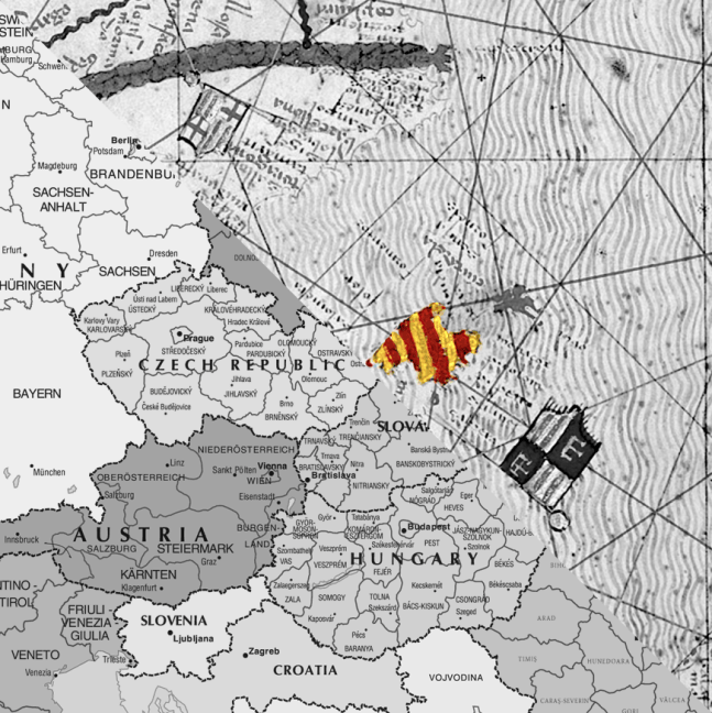
Finally, for international languages, let us look at a symbolic language that has taken over the World and literally shapes it.
We are talking about maps.
Political maps.
Like most of what we have seen, modern political maps are in part imposed by the Europeans.
Maps are almost as old as pictorial representations of the landscape, as we have seen in the case of [figurative art of the Pleistocene]. Peoples around the world not only represented the animals that surrounded them, but also elements of the landscape, like rivers, mountains or the stars in the constellations. Map-making seems to be quite essential for humans, as even kids can, from an early age, interpret and represent pictorial illustrations of elements of their world.
However, what is quite a Western addition to map-making is the overlaying of political and administrative borders and regions. Clearly delineated areas on a map are only conceptual ideas that exist in the heads of such administrators and their subjects, on top of the geographical depiction of the world.
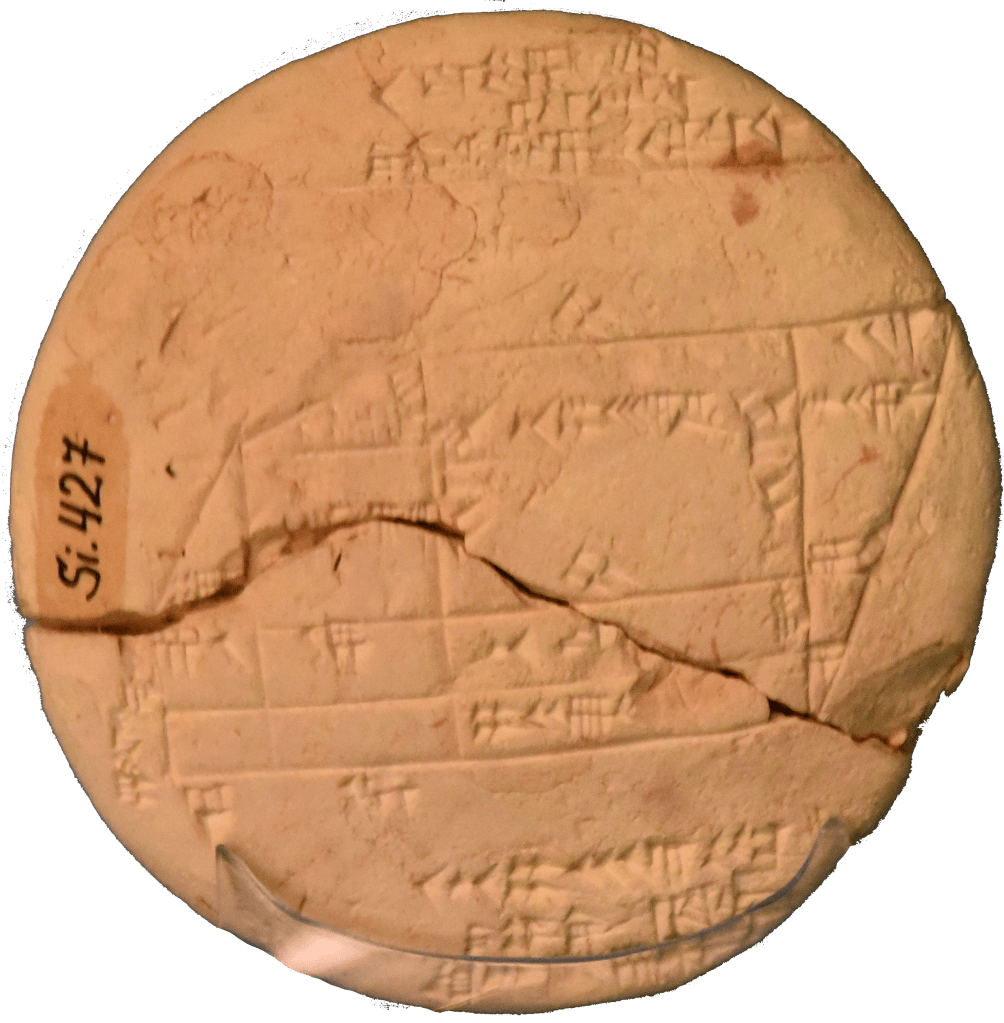
Though, the representation of land “ownership” on maps can be traced much, much older than European map-making. Like with the division of time, the Babylonians had a head start. By 1800 BC, they were already mapping parcels of arable land. The maps were drawn on clay tablets, with the names of the owners inscribed on them. These documents are great for property-owning rights, especially after each year’s floods destroyed the border markers. These parcel maps are also great for taxation reasons, the reason that these maps were created. Still, these plots of land are far from the political and administrative maps that we are so familiar with now.
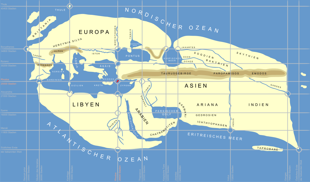
Moving west, in the classical period, we meet the crazy cartographer Eratosthenes, who by 200 BC wanted a perfect mapping of the World. To achieve that, he set about measuring the circumference of the planet, as we have already seen in THE Metre. But once you have the spherical body that the World is, he also exported the concept of dividing the circle and sphere in latitude/longitude to placing specific geographical features of the planet on a coordinate system that has also become universal: the coordinate system of parallels and meridians. With that basic idea, Eratosthenes set about placing every single point on the Earth into a specific coordinate. 2,200 years later we can easily do this feat with the Global Positioning System. The present GPS, though, improves on Eratosthenes and can even measure the displacement of landmasses after an earthquake and the movement of Australia to the north.
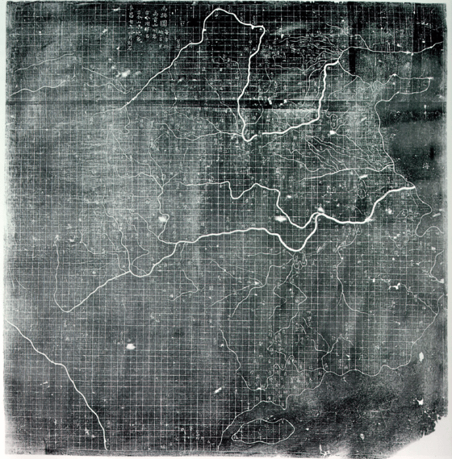
Chinese cartographers had sophisticated mathematical and coordinate traditions of its own. The contrast with the one we have now is that they had different different uses of grids. They divided their maps into rectangular grids, but as far as we know, they did not adapted that grid system to a planetary scale.
Before global oceanic navigation, Chinese, Islamic and European cartographic traditions used coordinate-like systems. Still, the modern coordinate system only became systematically central to global cartography with the onset of global navigation, where Mercator projection of maps that keep consistent meridians and parallels where much more useful to cross oceans than the rule lines that defined the previous Mediterranean navigational charts, the portolans.
The portolans came in the Mediterranean world by the XIII century. A prominent school of Mediterranean navigation charts, called “normal portolan chart” or nautical charts, emerged, and started to be revolutionary in the way that administrations saw themselves, was the onset of the political map.
Originally, the Portolan Chart was limited to the outlines of the coast and the names of the towns and ports along the coast; the interior was left blank, not unlike modern maritime maps. Portolan charts appeared rather suddenly after 1300. They constitute a sharp departure from all earlier maps. The portolan was oriented towards the north and focused on a realistic depiction of geographic distances with a degree of accuracy that is astounding, even by modern standards, which made it a really popular map for navigation. In fact, if we look at it nowadays, we can identify the clearly defined shores of the western Mediterranean, or the whole Mediterranean plus the Black Sea and western Caspian Sea. It is amazing to look at these charts and see how accurate they were.
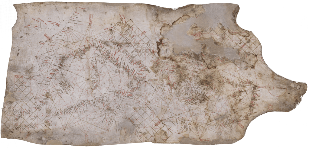
Carta Pisana, one of the few surviving navigational portolan charts. Unlike the much more decorated prestige versions, the nautical ones, which were much more common, did not survive much beyond their heyday, as the Carta Pisana shows in its deterioration in the upper-right corner.
The standard Portolan Chart emerged in Mallorca and north-western Italy (Pisa and Genoa). I would not enter deeply into the story of nautical map-making, and how the Mallorcan one became a standard. But briefly, the dominance of the Mallorcan school had to do with monks, Genoans, Pisans and Arabs compiling previous versions and nautical voyage information. Mostly, the logs of hundreds of ships and how long they took to go from one port to the other. Any single voyage can be biased by winds and the kinds of vessels, but when you integrate thousands of these, all around in the same area, you get quite an accurate description of where each port is situated from each other.
With the conquest of Mallorca, previously in the hands of a small Muslim kingdom, all that knowledge came together in Mallorca, and was primarly handled by Jewish artisans, who produced the most accurate charts. Then, they added some innovations like the compass rose. These charts, then, were widely copied across the Mediterranean. Like today, whoever has access to a large amount of quality data, and knows how to process it, has the advantage.
Interestingly, later in the XIII century, a stylistic divergence started to emerge between the Mallorcan and Italian schools. Italian portolan charts were sparse and restrained, strictly focused on coastal detail, with the inland areas left largely or wholly empty, and the charts largely bereft of illustrations. Mallorcan, meanwhile, developed a variant that contained inland detail and was replete with rich, colourful illustrations, depicting cities, mountain ranges, rivers and miniature people.
What is relevant here is that the Mallorcan nautical charts were of good detail and extra quality. Wealthy clients started asking them to produce more and more sophisticated, embellished ones, covering not only the western Mediterranean, but attempting to draw a World Map, or at least all the known lands stretching to China and Japan.
For that endeavour, they used all the information that they had, be it accurate or sometimes even mythological. When filling these blank inland spaces with all the information that they could gather, the Mallorcans decided to put a plethora of heraldic symbols, shields, and flags, identifying the ruler of each city. These complex creations were not for navigation but for the status of the buyer, and, amusingly, are better preserved than the nautical ones. A clear example of how luxury has a preservation bias.
Following this tradition of ellavorate maps, by1370 the Catalano-Aragonese royalty commissioned for the creation of a richly decorated chart that displayed all the knowledge of the World at that moment. This creation is called The Catalan Atlas. We do not know exactly how elaborated Portolans ended up in the hands of the Catalano-Aragonese royalty, but it is not difficult to imagine that they saw versions of Portolan charts and commissioned one to be done richly. Some islands, and cities, had well-assigned symbols printed in a two-dimensional representation of the known World. Moreover, some symbols and notations started to become “standardised”, like painting the sea blue, the Red Sea “red”, mountains as peaks or rounded shapes, and the familiar network of rivers.
What is relevant is the case of the Catalan Athlas, and other similarly rich portolans, is that for some islands, the whole territory was painted with the colours of the flag, in effect covering the whole land. Maybe the monarch asked for the heraldic symbols to be prominent in it, or maybe the author decided that the royals would like the touch.
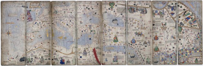
From these covering of island landmasses with flags, I argue that, by covering these islands completely with the heraldic symbol, they started the modern tradition of political maps.
In the case of the Catalan Atlas, the island of Mallorca itself was painted in the colours of the Catalano-Aragonese royal family, four stripes of yellow and red. While Rhodes, by the Anatolian mainland, was painted in the Knights Hospitaller flag, because it was controlled by them at the time.
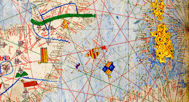
My hypothesis that this painting of Mallorca, and Rhodes, with heraldic colours is the beginning of the modern tradition of political maps might be due to bit of cultural bias. But however it is, the Catalan Atlas is an early example that reached prominence in the European practice of placing your colours into a map to designate territories by the mid-1370s. To be fair, I do not have references on when states put invisible border lines on a map and painted them with a different colour than their neighbours, to signify possession. Probably it is something that more or less was always in the background of the minds and map-making, as the Babylonian map showing the limits and owner of a field already attests.
It is not difficult to imagine how this kind of symbolic, and political, representation could further develop in a contest of who owned more of the parcels of “land” with the flag colours across Europe. In fact, the heir to the Catalano-Aragonese crown gifted the Catalan Atlas to his brother-in-law, the king of France, and it still remains in France.
Moreover, the Catalan Atlas and similar rich maps create the need to fill the “blanks” on the map. Since people wanted these spaces to be “full”, the distant seas of these maps were all covered in miniatures and fake islands. But as knowledge improved, the fictitious islands had to be removed or displaced, and the big pictorial representations on the edges, showing kings and animals, were replaced by “blanks” showing ignorance, the “to come” side, which well aligned with the epoch of exploration by the European merchants, nations and explorers that was coming by the XVI c.
The Europeans kept on developing these two-dimensional representations of the World and, as with the Babylonians, used them to demarcate which land belonged to whom, especially in the case of colonial growth.
This fact of Europeans imposing their World view through maps is well illustrated by the history of how the boundaries and borders of Nepal were drawn. Nepal is one of the few countries in the world that was never directly ruled by a foreign government, though it was not considered an independent state by the British for decades and its foreign affairs were conducted by Britain from 1816 to 1923, although with much more authonomy and independence than the other princely states in British India.
When the British arrived in the subcontinent, they brought with them a European notion of sovereignty, including a novel conception of a nation-state’s boundaries. For the British, and the rest of the European powers, a political boundary was a key feature of a nation-state’s sovereignty: a clearly demarcated line that differentiated between territories. This was as alien to the local (Gorkhali) political tradition as it was to other princely states of the subcontinent, where “boundaries” were fluid constructs defined by physical and geographic features. They were only concerned with the control of villages. That control waxed or waned according to the military strength and vigour of the ruling dynasty.
Nepal’s boundaries were traditionally a fluid affair. Nepalese rule possessed “an unbounded space” that facilitated movements of trade and people. The territorial borders experienced frequent shifts in administration determined by the environment, tribute and taxation claims, which were adjusted year by year, and landholding patterns. Thus, Nepal’s frontiers with the Anglo East India Company oscillated among different agents.
The British viewed borders as fixed and immutable, leading the Company to interpret Nepal’s fluid boundaries as encroachments on British territory. They clearly saw these magical lines on the land that they had seen so many times in their lives.
To better see these lines on the new lands, the East India Company proceeded to survey what they considered the borderlands and fix them in map-making projects. These activities involved carving political and administrative boundaries in Nepal to render the territory “more legible for colonial rule”. These maps served as a strategy for the Company to divide land into non-overlapping, fixed spaces, unlike the traditional shifting and porous Nepali boundaries.
Disputes over territoriality, therefore, constituted a driving cause for the conflict between the Company and Nepal’s fluid borders. By 1813, the British Governor General re-examined the border dispute between Nepal and the Company. Negotiations with the Nepali government to establish a clear boundary soon failed. For example, the Nepalese Commissioners remarked on the futility of debating about a few square miles of territory. About one year later, Britain formally declared war on Nepal. In Britain’s government views, confrontation between the two powers was “necessary and unavoidable”, since there was no clear border.
To solve the protracted war that neither side meaningfully won, but the Company dominated, they signed the Sagauli Treaty (1816). The treaty illustrates how much emphasis the Company put on the detail of the boundaries, for example, stating with extreme detail that “hills eastward of the River Mitchee including the fort and lands of Nagree and the Pass of Nagarcote leading from Morung into the hills“. However, despite the extreme detail, even after the conclusion of the war, the border was not yet settled. The boundary was not defined to the satisfaction of the British until 1830, and still remained a matter of discussion for several years afterwards.
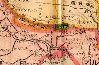
As a result of the war, the treaty took away most of these porous borderlands that Nepal operated with, and a significant part of its pre-war land, like the nominal control of control of the kingdom of Sikkim. Moreover, the Treaty of Sugauli significantly curtailed the independence of Nepal. It was not until 1923 that the British allowed Nepal to fully conduct its foreign policy.
Although political maps were not the only reason for the conflict, the Anglo-Nepali War illustrates how a specific World View of clearly defined boundaries and administrative limits was imposed. Western nations forced, through war and diplomacy, the rest of the World to see the surface of the planet through clearly defined “magical lines” on the land.
As we have seen, other administrations in China, Mesopotamia, South Asia and Mesoamerica, represented territorial jurisdictions and political entities cartographically, however, it is the modern European conception of the sovereign state as a precisely bounded territory became globally dominant through European expansion.
Like English for spoken language, modern political maps are a Western-defined universal language. Now we live in these colourful creations that define how we see the World, and sometimes perversely try to shape that “imagined reality” into the real world, forcing the actual reality of life to adapt to the lens of land, and also seas, covered by neatly delineated lines defining boundaries. This world reality was not common in the World until the Europeans forced it down the throats of everybody else on the planet, by whatever means necessary.
Now we live in this “imagined reality” of nation-states. Now we will see how this reality, this “universal language”, defines how, and who, asks “what does humanity want?”
Previous
 humanitywants.org